client:
eBay
Project:
eBay Open
ROLE:
Branding and 2D Creative Director

BRIEF/Objective:
eBay was planning on upping their game with their annual user conference eBay Open. I was engage to create a separate brand (using their corporate brand as a baseline) that would be used not only specific to this event but also elements to be applied across their events.
Another consideration I was tasked with was re-inventing how exhibitor booths are approached. How can we keep a sense of openness and still have privacy and sound-blocking without making the floor look like a high school science fair.
Approach/Outcome:
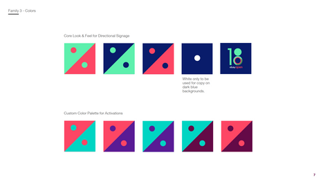
There was a unique challenge with this branding project, eBay's color palette consisted of over 70 colors. This was one of the starting off points, paring back the colors to set the tone, so to speak.
In developing the brand and iconography for the event I used the 'O' to create a system of symbols. These symbols along with color coding created a language to demark directions, spaces and activities.
When it came to reimagining the exhibitor booth I approached them as creating a zig-zag instead of stacked H's. This minor alteration created not only a more open space and better visibility but also allowed for less materials to be used.


